¶ Lists, Records, and Fields
Standalone Training Guide
Version: 20260605
This guide focuses on the shared list, record, and form behaviors used throughout AssetTrack. These same controls appear across asset lists, embedded related lists, search dialogs, display forms, and regular record forms.
¶ Contents
- Record Lists
- List Controls and Row Actions
- Sorting and Column Header Actions
- Column Selector
- Query Builder
- Regular Forms
- Common Field Types and Controls
- Tabs and Embedded Lists
- Display Forms
- Quick Reference
How to use this guide: The screenshots in this guide use Asset and Asset Lifecycle examples, but the controls work the same way across the platform wherever users have permission to view or change data.
¶ Record Lists
A record list is a table of records. Record lists are used throughout AssetTrack to view assets, models, audits, lifecycle events, consumables, and related data. A record list may include actions for creating records, selecting rows, bulk editing, deleting, filtering, sorting, choosing visible columns, refreshing, and paging through results.
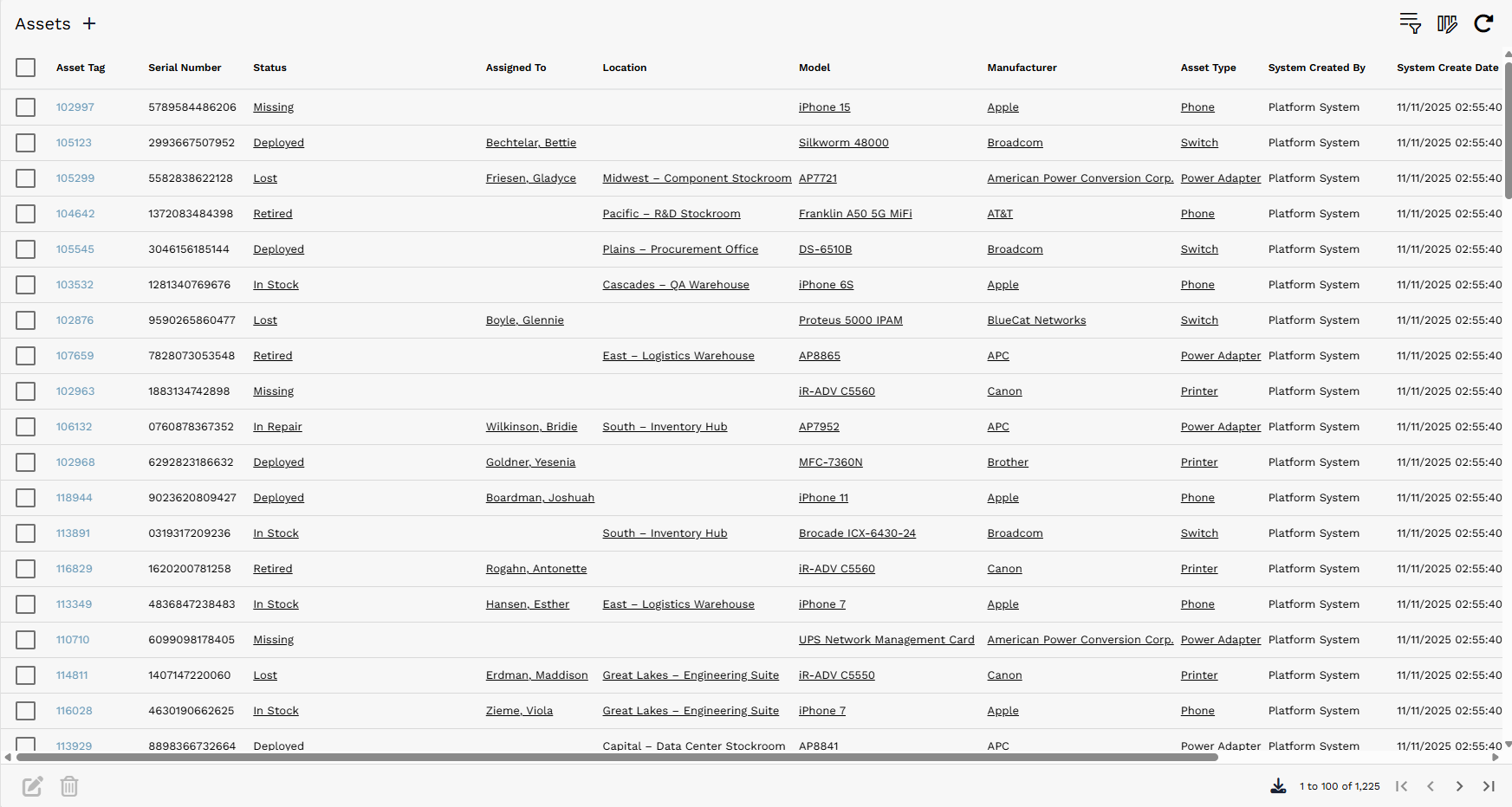
Example Asset record list with row selection boxes, sortable columns, query controls, column selection, refresh, and pagination.
¶ List Controls and Row Actions
Most list actions depend on the current list and the permissions granted to the user. The common controls below appear on many record lists.
| Control | Where it appears | What it does |
|---|---|---|
| Check box | Left side of list rows | Select one or more rows. Selected rows can be deleted or edited in bulk when those actions are available. |
| Bulk edit / pencil | List action area | Edit selected records in bulk. This becomes useful after records have been selected using the check boxes. |
| Delete / trash | List action area | Delete selected records when the user has delete permission. |
| Query Builder | Top right of a list | Open the Query Builder to filter the list and optionally set ordering. |
| Column Selector | Top right of a list | Open Column Selection to choose which fields appear as columns in the list. |
When rows are selected, available row-level actions appear or become enabled. The pencil icon is used for bulk edit, and the trash icon deletes the selected records.

Bulk edit and delete controls that are used after rows are selected.
¶ Sorting and Column Header Actions
The arrow beside a column header can be used to quickly sort that list by the selected column in ascending or descending order. Right-clicking a column header opens a context menu with additional column actions.

Column header sort indicator showing System Create Date sorted descending.
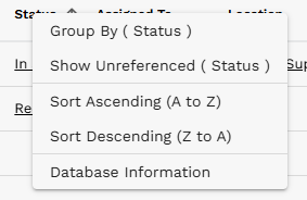
Column header context menu with Group By, Show Unreferenced, Sort Ascending, Sort Descending, and Database Information options.
¶ Column Selector
The Column Selector is denoted by three columns with a pencil. It lets users control which fields appear in a list view and in what order they appear.

Column Selector icon.
- Highlight a field in Available or Selected.
- Use the single arrow > or < to move the highlighted field into or out of the list view.
- Use the double arrows >> or << to move all fields in or out of the list view, regardless of which field is selected.
- Use the up and down arrows in the Selected section to reorder visible columns.
- Select Okay to apply changes, or Cancel to close the dialog without applying changes.
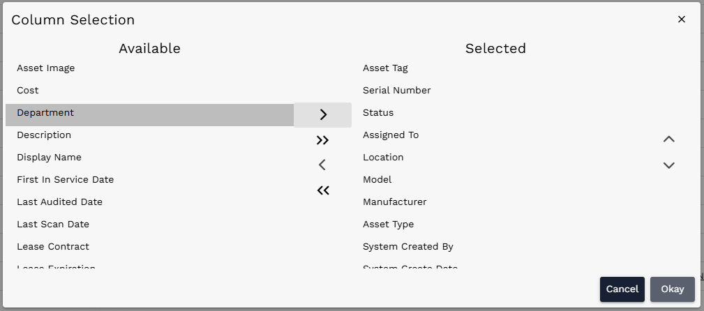
Column Selection dialog with Department highlighted in Available.
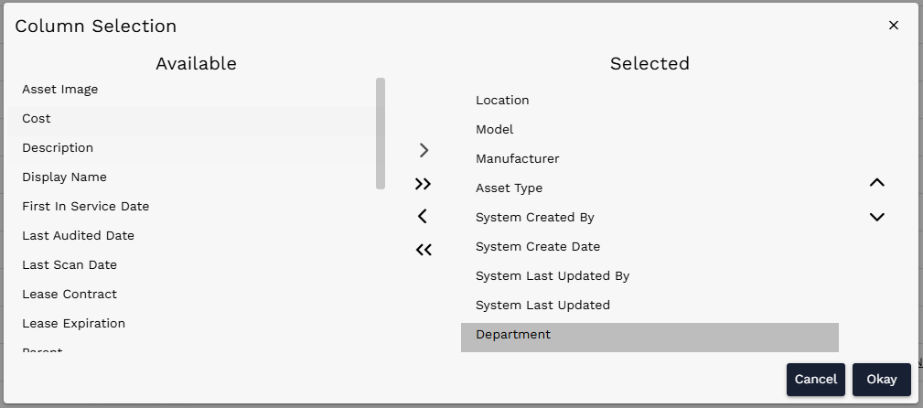
Column Selection dialog after Department has been moved into Selected.
¶ Query Builder
The Query Builder is denoted by three lines with a funnel. It is used to filter lists and search dialogs. A basic query is built by selecting a field, selecting an operator, and then selecting or entering a value.

Query Builder icon.
¶ Basic query workflow
- Select a field to filter by, such as Status.
- Select an operator, such as equals, not equal, is empty, or is not empty.
- Select or enter a value, such as In Stock.
- Use AND to add a required condition. Use OR to add an alternative value for the last condition. Use Add OR group to create a separate set of conditions where either group can match.
- Optionally use Add Order By to set the sort order applied with the query.
- Select Okay to apply the query to the list.
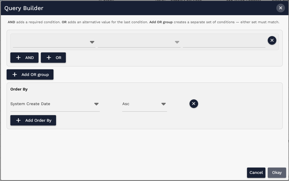
Query Builder dialog with condition and order-by sections.
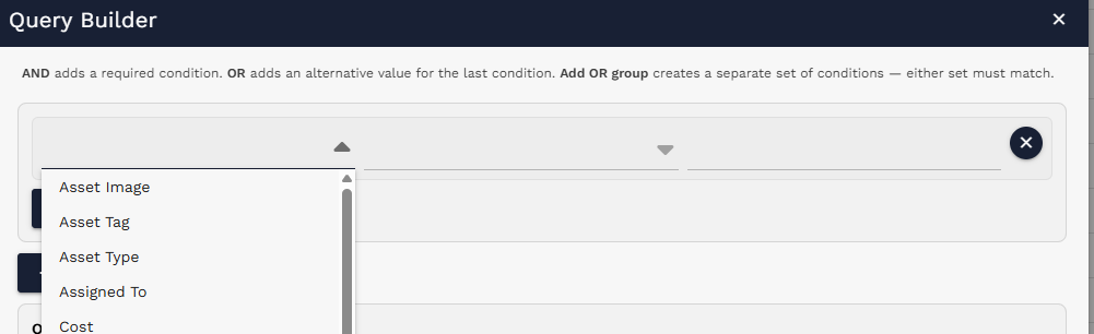
Field dropdown while building a query.
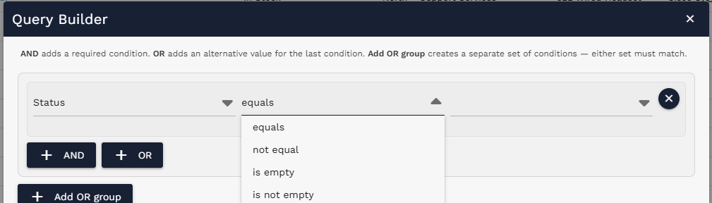
Operator dropdown showing available operators.
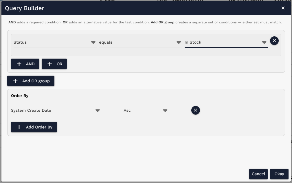
Completed query filtering Status equals In Stock and ordering by System Create Date.
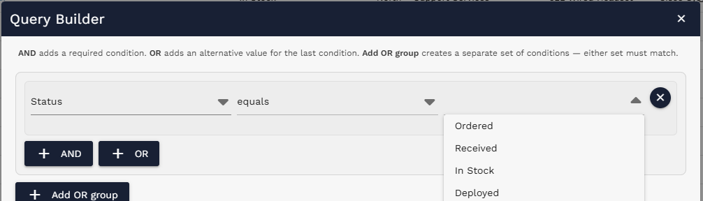
Value dropdown example showing status values such as Ordered, Received, In Stock, and Deployed.
¶ Regular Forms
Regular forms represent persistent records stored on tables. Examples include Assets, Models, Audit Definitions, Audits, Consumables, and Lifecycle Events. These records can be opened later, updated, saved, and, when permissions allow, deleted.
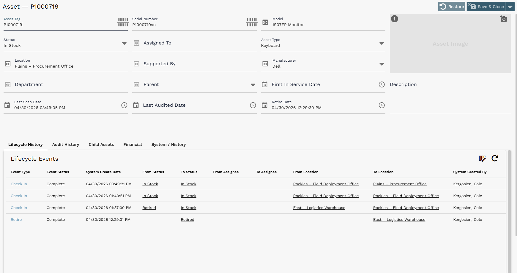
Example regular form: Asset record with editable fields, tabs, image area, and an embedded related-record list.
¶ Saving and restoring changes
The upper-right corner of a regular form may include Restore, Save, and Save & Close controls. Restore removes changes that have not been saved. Save saves the record and keeps the user on the form. Save & Close saves and returns to the previous page or list.
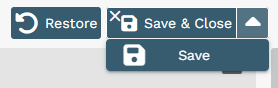
Save menu with Restore, Save & Close, and Save options.
¶ Common Field Types and Controls
Forms can include many field types. Common examples include character fields, reference fields, select fields, date-time fields, image fields, currency fields, duration fields, and rich text fields. The field controls below are some of the most common users will interact with.
| Control / Field Type | How it works |
|---|---|
| Dropdown arrow | Appears on reference and select fields. It expands available options. If the arrow is not visible, typing underscore (_) can also expand available options. |
| Reference preview | The eye icon opens a preview of the selected referenced record. |
| Date-time controls | Calendar and clock icons let users select date and time values. |
¶ Reference and select fields
A downward arrow on a field indicates that the field can be expanded. Reference fields point to another record, such as a person, model, location, manufacturer, or consumable type. Select fields allow users to choose from a controlled list of values.
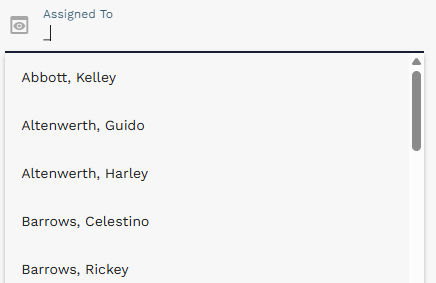
Reference field example: expanding Assigned To to choose a person.
¶ Reference record previews
An eye icon next to a reference field opens a preview of the selected record. From the preview, users can review key details or navigate directly to the referenced record using the arrow icon in the preview window.
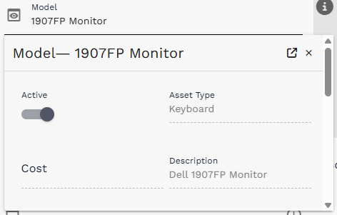
Reference preview example for the selected Model record.
¶ Date-time fields
Date-time fields include calendar and clock controls. Use the calendar control to choose a date and the clock control to choose a time.
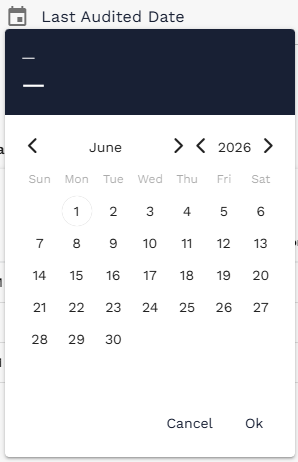
Calendar control for selecting a date.
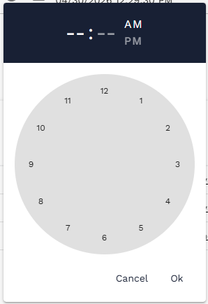
Clock control for selecting a time.
¶ Tabs and Embedded Lists
Some forms include tabs that switch between sections of the record. Tabs may show related information such as Lifecycle History, Audit History, Child Assets, Financial details, or System / History. Many regular forms also include embedded lists that are pre-filtered to show related records. Normal list controls, including query, sort, refresh, bulk edit, and column selection, also work on embedded lists.
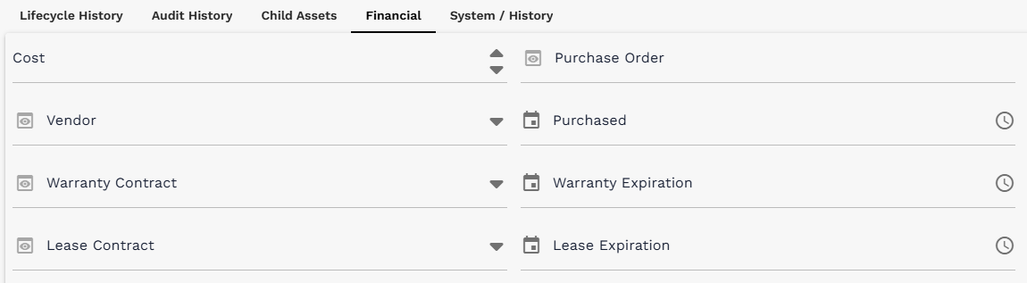
Tabbed section showing Financial fields on an Asset form.
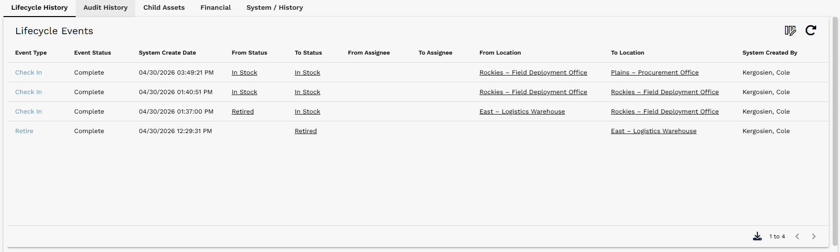
Embedded Asset Lifecycle list on an Asset form. The embedded list includes list controls just like a standalone record list.
¶ Display Forms
Display forms are interactive interfaces rather than persistent records. They are used to update other records in bulk, trigger actions, or guide users through a workflow. Display forms can contain fields, buttons, lists, and other UI elements similar to regular forms, but they do not usually have Restore, Save, or Save & Close buttons.
The Asset Lifecycle Action page is an example of a display form. It lets users search for assets, build a selected asset list, and run lifecycle actions such as Check In, Check Out, Move, or Retire. The page itself is not a saved record.
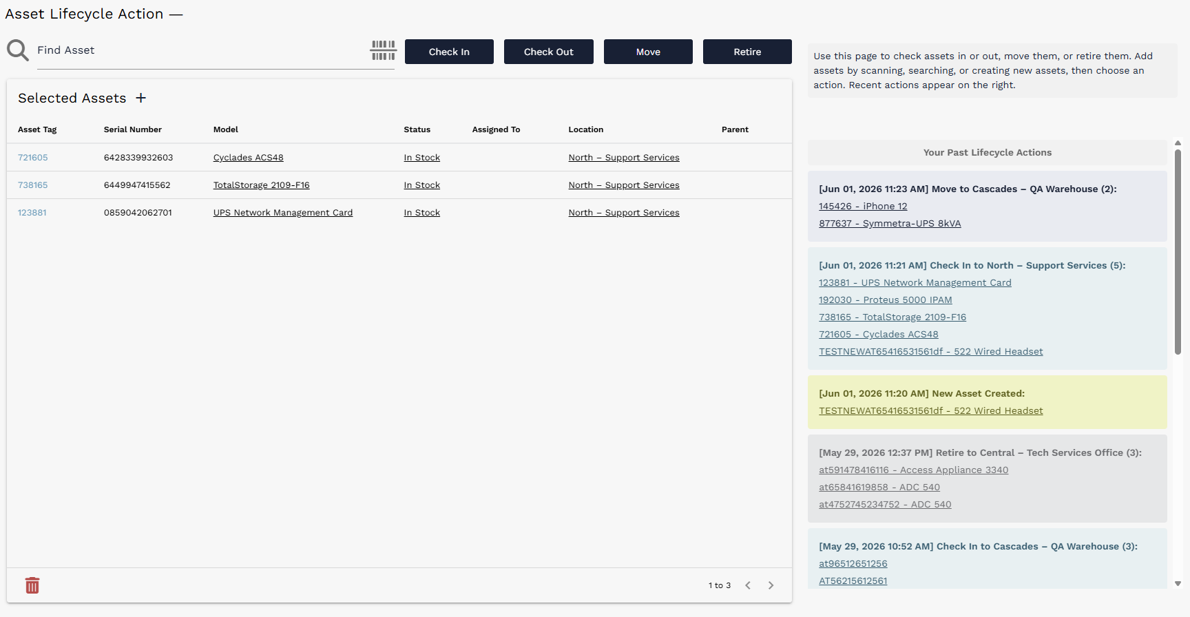
Example display form: Asset Lifecycle Action interface with fields, buttons, selected assets, and recent actions.
Regular forms vs. display forms: A quick way to tell the difference: regular forms usually represent a saved table record and have Save or Save & Close controls. Display forms usually support an interaction or workflow and do not save themselves as records.
¶ Quick Reference
| Task | Where to look / what to use |
|---|---|
| Select records for bulk action | Use the check boxes on the left side of a list. |
| Edit selected records | Select rows, then use the pencil icon when available. |
| Delete selected records | Select rows, then use the trash icon when available. |
| Filter a list | Use the Query Builder icon with field/operator/value conditions. |
| Choose visible columns | Use the Column Selector icon, then move fields between Available and Selected. |
| Sort a list | Use the arrow on a column header or right-click the header for the context menu. |
| Preview a referenced record | Use the eye icon next to a reference field. |
| Save a record | Use Save or Save & Close on regular forms. |